Well, thanks for all your comments. Yes, the flash was the problem here. Since I took this photo, I've come accross quite good lightning equipment so if I were to take the picture again, I would have done it differently.
Initial thoughts/My opinion Great resolution, nice looking books, too sad that a flash was used.
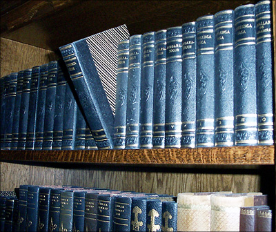
Content/Composition The books themselves look nice due to their colour and nice texture. Taking just one out of the row is also a good choice. Showing a hand taking the books out might have actually been even better.
One compositional element that is important to such an image is to keep the image clean, i.e. showing only the things that are necessary and avoid anything else that does not belong there. In this image it's the lower row of books that is unnecessary. If it is cropped away the image gets much clearer, the book shelve serves way better as leading line and the more rectangular image looks much better.
In principle similar arguments can be used for the shelve itself: the wood disturbs a little too, especially at the very right. However, this could be better addressed using different light.
Camera work -technically A major issue is the light: an important rule for indoor still-life photography is to avoid direct flashlight: it's simply too harsh, gives bad reflections that cannot be controlled by you and also strong shadows. Taking a simple desk lamp and moving it around the subject to see when the light and shadows look best is not only fun, but makes the whole atmosphere. Of course for doing so, a tripod or another good support for the camera is needed. Focus is set to the book that is taken out and that’s just right.
Digital Processing - Technical The image could have been sharpened a bit. A well fitting border might be good here too.
Fits the challenge Yes, very well, the intention gets through even without the title.
I like your resolution, and this certainly illustrates it. Main problem are distractions created by your lighting. The on-camera flash created a very hot foreground, an unevenly lit background, and an unwanted shadows including the one behind your subject book. Natural lighting might have worked better.
Light a bit harsh from use of the flash, but you've captured the color and tones of the books well. They are appealing to my eye but it seems like not much thought went into design of the composition.
The concept is nice. You use the flash to get it, but flash lit is even complex to use. It gives a color dither and subtle changes in tones. When using flash try to positionate it on an angle and distance that covers all subject. Prefer like you do, choose not straight angles.





 Add photograph to your favorites
 Add photographer to your favorites


 Photographer found comment helpful.


