Would have really loved advanced editing here. Hopefully it does fairly well as is. I am a bit concerned about the bw conversion as, once again, I was forced to do it on my laptop and haven't had a chance to look at it on another monitor.
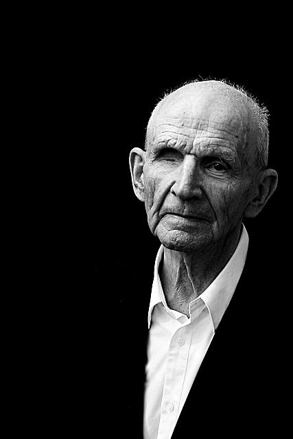
This is my grandfather, Lars. He's now 87 but remains wittier and more full of life than most of the 20 year olds I know.
Hooray! Thanks for the ribbon. I've done well with a couple of shots of this particular old-fella here, but the last one was eighteen months ago, so I thought I'd give it another shot. He'll be absolutely thrilled I'm sure.
Statistics
Place: 2 out of 374 Avg (all users): 6.8794 Avg (commenters): 8.0714 Avg (participants): 6.7059 Avg (non-participants): 7.0088 Views since voting: 6665 Views during voting: 290 Votes: 199 Comments: 54 Favorites: 15 (view)
I like this a lot. I am new here at DPC and want more information about so many photographs. It would be great to read more about the technical aspects of this shot. Where was the zoom set - f-stop and shutter settings - existing light conditions and auxiliary lighting. Post processing steps.
Thanks for submitting this entry
another fantastic result of using negative space to enhance the primary subject. The first glance at the thumbnail made me feel that by pushing the suit down to the black point, you had made the image uncomfortably arranged and I didn't like it.
Click on that thumbnail and this thing unfolds on the desktop.
Stunningly managed gradients and textures. Beautifully controlled whites. Those alone define the image as intentional, and thus begins the eye's journey into why.
the missing suit jacket becomes an implication. Something you expect to see but don't.
What a powerful counterpoint for the tragedy of his eye.
Totally brilliant and excellent in every way. I don't usually just look at an image just to look at it as long as I did for this one. I just sat and stared. I hope that says enough.
i love the way his whole right side just disappears... as if he no longer needs it with the loss of the eye. great emotion captured here. nice texture.
This is classic.. I love how the white of his shirt forms a v emphasising his face. The lighting is gorgeous, and his face is so interesting. Best of the challenge.
ahhh, back to your favourite subject...and understandably so...
I love how you handle light, and the beautiful details in your grandfather...strange to see his coat disappear, and yet appropriate...
yes the space at the top makes him smaller, and perhaps more vulnerable, and certainly ties in with the need of voters to really see the 'negative' space, but I am struck by how this seems to cheat me...without the context of some information in the background his being there is enough, the top part could then be cropped by 1/5th or so, and then I am not wandering, for the missing eye beside the darkness is what grabs me first, but then the seeing eye is the one where the real tale is told...
knowing you have entered this shot leaves me wondering where your artistic choices in the composition are and where your competitive ones are, a shame really because I think you're portrait here is sublime...
I would certainly be proud to have taken this shot...
this is very good use of the negative space. the emptiness adds to the picture compared to alot of the other photos in the challenge. ihope this does well.11





 Poise
Poise Add photograph to your favorites
 Add photographer to your favorites

 Photographer found comment helpful.


