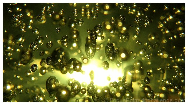
A very effective photo. And a nice demonstration of how breaking photography "rules" can contribute to a photo's appeal. The large burned out spot would be too distracting in most photos, but here it becomes the focal point that ties everything together. And nothing here is in really sharp focus, another common photo killer. But the spherical forms are apparent and the lack of focus suggests chaos rather than carelessness.
But other rules are followed and lend stability and order that hold the viewer's interest. The bright spot has a great rule-of-thirds placement. The tones are nicely balanced, with the predominantly dark tones offsetting the few very bright ones. And the implied diagonal lines emanating from the center make this really dynamic.
I have two complaints about the photo. First, I wish it was more squareish. The 2:1 ratio seems a bit flat; I think a 4:3 would work better. Second, I really don't like the white border. It just doesn't work with the dark edges of the photo. And it puts a boundary on the "universe". I think it would work better with no border at all. Even if you printed this photo to hang it on a wall, I think it would work best flush-mounted on a board rather than framed!
Cool concept. I like how you've used the light source.
my guess- you broke open a couple dozen old mercury thermometers and dumped the mercury in a clear bowl of water?
Good title for this, good colour but the bright spot in the middle is a bit too bright. I guess this is a glass paperweight but I suppose it could be a bottle of shampoo or hair gel too.
great idea, composition. horrible, horrible colors. even in basic, you could have shifted the hues and made this into something more inviting and mystical...





 Add photograph to your favorites
 Add photographer to your favorites

 Photographer found comment helpful.


