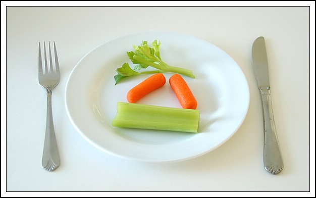
Well, I was going for a minimalist approach to this topic, but ended up a bit too busy. The lighting bugs me too: side lighting creating a darker right side, plus the utensils are crooked. I still liked it enough to submit it.
Statistics
Place: 16 out of 169 Avg (all users): 6.2645 Avg (commenters): 6.6957 Avg (participants): 5.8416 Avg (non-participants): 6.5674 Views since voting: 1587 Votes: 242 Comments: 23 Favorites: 0
Simple, beautiful, and horrible :-) I'd had to start a diet with THAT in mind! A nice, clear photo. Perhaps a little too long in shadow, but it's a good pic.
This is a good picture techically and it does meet the challenge. But it is a bit boring. White on white with just the bit of color in the vegtables makes me loose interest. It looks like a stock magazine photo. In my opinion it needs some more color somewhere such as a colored table cloth. That would make the plate stand out more.
Would like to see some reflection on the knife and fork as they appear a bit dull and boring.
also.. is that rust on the knife? :)
nice composition and like the colours.
good luck!
This is a really good set up shot. I'm being really picky here, but I don't really like the spots on the knife, although that didn't affect my scoring at all. Good work!
You know I don't dislike this shot at all. I think it's generally good. I guess the down fall is the fact that it's a little boring. Having said that I don't really have a fix for you. I guess maybe more of the veggies, cropped tighter and maybe a few half eaten pieces.??? Your light is very good, as is the focus.






 Add photograph to your favorites
 Add photographer to your favorites


 Photographer found comment helpful.


