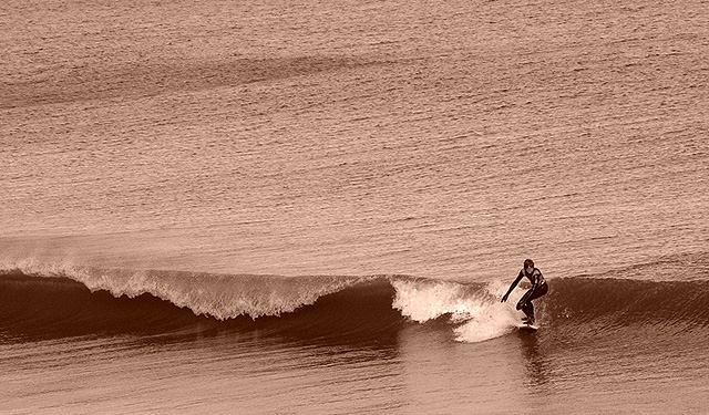
I'm not sure I like the use of the sepia tone, which gives photos a very dated look, however surfing has the feeling of a modern activity. I therefore think black and white may have better suited the image.
Nice composition, the sepia tone doesn't do it for me because the background is not varied enough for the tone to be interesting. THe sea ends up looking like rough concrete. And man- its tough to hang ten on that puny wave!
I really like the way you've captured the shape of the wave and the placement of the surfer. I think a tighter crop might have worked better, say about two-thirds of the total.
Nice action But I dont like the sepia tone
The sea is a lovely colour and I think the natural colour would give the image more life. as it is it looks more like a ploughed field with a wave.
Although having said that probably the next comment you get will say it looks great in Sepia Great image though
Nice to see a change in format for surf photos. The sepia make the shot look serene yet you can still feel the power of the wave. Composition is also very good. Although the subject is in the bottom right, the picture seems to invite you to look at the scene as a whole. Great shot!
What an unusual surfing shot - a very different feel from most. I think the strongest element here is the composition - the slightly diagonal line of the wave is very very strong and the position of the surfer cuts is just at the right point. This is a great example of a composition that doesn't use the rule of thirds but works superbly. I like the choice to go black and white but find the tone too pink.
I like surfing shots in general, but I can't say that I understand your choice of toning. Normally, sepia would be used to create a sense of the past, but that doesn't seem to be the goal here. It looks more like the surfer is surfing in muddy water than anything, I'm afraid...
Really like this, so simple, yet can feel the action of the surfer. Might have benefitted with a border round the picture? While I like the plain sea at the top, I think it stops too suddenly, a subtle border may have helped this. 9






 Add photograph to your favorites
 Add photographer to your favorites


 Photographer found comment helpful.


