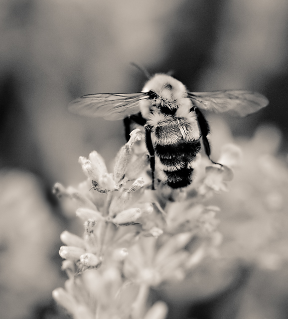
converted from RAW and cropped, adjustment layer for levels; I converted to B/W using an Alien Skin film filter. USM.
I went for B/W because while the color version was very appealing to the eye, I really wanted the viewer to home in on the bee and not be distracted by all the surrounding flora.
Statistics
Place: 222 out of 381 Avg (all users): 5.3488 Avg (commenters): 6.0000 Avg (participants): 5.3239 Avg (non-participants): 5.3793 Views since voting: 846 Views during voting: 194 Votes: 129 Comments: 15 Favorites: 0
Technicals: Good. I don't see a lot wrong with the technicals. Nice sharp focus, nice DOF, nice lighting, nice composition.
The feel: While I get your drift with the B&W application, I may have tried to force attention on the bee through burning/dodging and desaturation of surrounding colors (while keeping them). It would be another method to give the bee extra attention. That said, it doesn't mean this choice was wrong. It does bring out the texture of the bee nicely.
The game: I actually like this one and would have expected it to do somewhat better. It could be that choosing the backside of a bee just wasn't that great a subject as we like to see their front (or side) in macros. I almost entered the backside of a dragonfly, but ultimately didn't because it just didn't look right to see it from that angle.
I was one of your 8s. I love the DOF you chose and the tones as well. The lack of color and the gentleness in this really strike a chord with me. I think it's because we associate bees with "busy" yet this seems so peaceful.
The response to the b/w is interesting. Personally I liked the color version better, but this is has very nice tones for b/w. Decent score, but I think it should have been a bit higher. Those trolls who vote 1 and 2 really do significant damage. Without those two votes you would have had 5.4094. There was no justification for those two low votes. I just hate it when people do mean things like that.





 Add photograph to your favorites
 Add photographer to your favorites

 Photographer found comment helpful.


