Author Thread Comments Made During the Challenge
Post actions
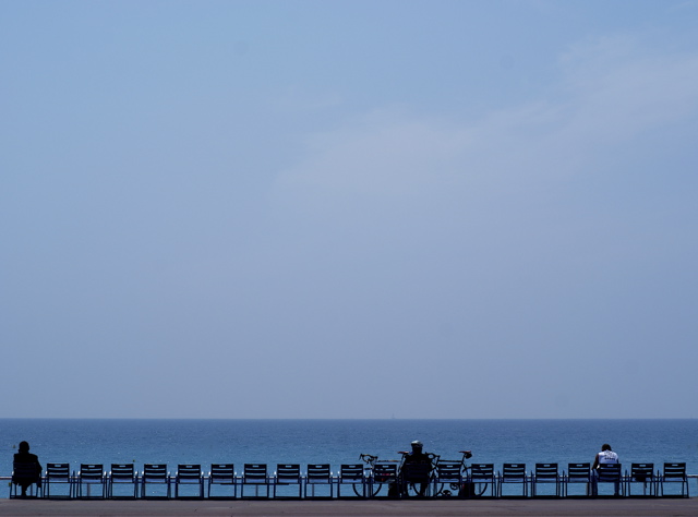
Nice lines and I like the bold crop.
Post actions
I like the negative space, and it would have been good for that challenge this week also.
Post actions
Post actions
Would have been good for negative space challenge. Little flat in lighting but not a bad capture.
Post actions
A little more contrast and this should ribbon. Great, great comp and capture.
Post actions
Nice use of the negative space. Lovely blues. Excellent subjects.
Post actions
I like the use of the blue negative space and the repeated, and sometimes interrupted, patterns at the bottom
Post actions
C'est la Promenade (ou Boulevard?) des Anglaises, n'est ce pas? Would have been nice (no pun intended) if there had been a Yacht or a surfer on the water. Also needs some more saturation IMO
Post actions
good job getting a level horizon and a level row of chairs.
Post actions
I like your use of empty space here (I actually think it would have done even better in the "Empty Space" challenge)
Post actions
LOL... Were you meaning to put this in the Negative Space challenge as this would have fit nicely there!
Post actions
One of the best. Nice minimalism. Nice shades of blue.
Post actions
Post actions
Very nice composition, i like the minimalistic look of this. Only nitpik is that the sky looks too uniform and bland, wud have been great if it had some shades, not in your hand i guess :-) 7
Post actions
hmnn... good for this challenge, also suited for negative space.





 Add photograph to your favorites
 Add photographer to your favorites


 Photographer found comment helpful.


