Author Thread Comments Made During the Challenge
Post actions
great photo. Subject looks a bit over saturated though...
Post actions
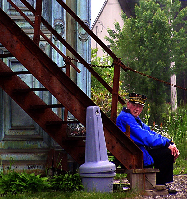
The man looks a little OOF. IMNSHO, this could do with a tighter crop -- I'd suggest that you shave some off the top so that the top of the main support ends in the upper left corner. That would also emphasize the diagonal leading the eye to the conductor.
Post actions
a little too soft in the focus.
Post actions
Your colors look like you oversaturated them and this is quite distracting. You can see it the most in the gentlemans blue goat and in his face...
Post actions
Seems to be a little too much noise...It also do not like how he is facing out of the photo..
Post actions
Nice candid image though to my taste possibly a little overboard on the saturation. Good shot though
Post actions
Color is really bad on the image. Maybe the exposure was too shadowed. I think you might want to try to expose for your subject, even if the background becomes overexposed.
Post actions
Tones are all out and over done...
Post actions
Like the composition and colours but it's let down by lack of sharpness.
Post actions
Way too much Hue & Saturation in the processing.
Post actions
a closer crop and not so much color and you had the blue!imo
Post actions
It appears overly saturated. I think it would've made a nice B&W
Post actions
His face is extraordinarily red - I think I may have been tempted to tone it down somewhat.





 Add photograph to your favorites
 Add photographer to your favorites


