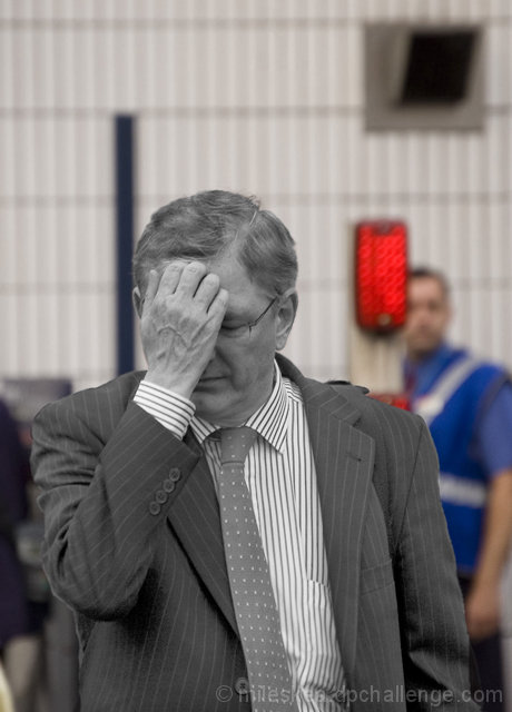
Nice idea with the desat but Im not sure it worked. the red sign really draws my attention particually as it cuts the person behind it. Perhaps it would look better totaly BW. good luck
too much processing...the black and white and red light makes for an odd photo, and clashes, and is not elegant or pleasing. If the message was to correlate a "red" sign its loaded meaning with his state I can see where that is going, but otherwise...5
Like this image a lot more on second viewing than I did on first. The B&W works well as the greyness really helps get across the feeling of exhaustion. Nice desat job too
Like the capture but I feel the selective desat does nothing for the image here - Red is where the eye will go and thats what happens here - It takes us away from the main subject.






 Add photograph to your favorites
 Add photographer to your favorites


 Photographer found comment helpful.


