|
This is a very nice image. I like the color of the sign against the color of the background. I think though that maybe I would like to have the black a bit blacker. As is, I can see the sign post, but I can also see that the horizon line is tilted slightly. Overall very nice though. Worthy of at least one comment. :) |





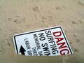


 Going to Nowhere
 Add photograph to your favorites
 Add photographer to your favorites


