Author Thread Comments Made During the Challenge
Post actions
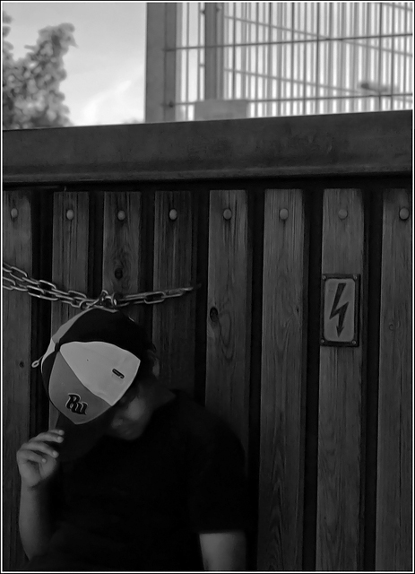
just too dark for me... Maybe crop the sky off and play with brightness for jsut the fence and the boy??
Post actions
I think the bright spot above the fence draws away from your main subject.
Post actions
This is very underexposed... I would love to see the detail that is almost there.
Post actions
A little too dark at the bottom of the photo for my taste..
Post actions
To dark to see any detail of the main subject
Post actions
I think it is an interesting shot, but there is so much detail lost in the dark sections, it is difficult for me to tell.
Post actions
Much too dark. Can't even see the subject, though your detail on the background came out very nice.
Post actions
A bit too dark on my screen ....
Post actions
Not overly sure about this image and the title (which I dont mark on) doesnt really seem to clarify matters, do love the focus and textures of the grain behind the subject
Post actions
Just a bit too dark. I would have liked to see his face a little better.
Post actions
Not sure what you've done, but the processng on the face looks VERY odd.
Post actions
Not sure about the processing over his face.
Post actions
This looks like it's been NeatImaged to death. The texture on the face is awful. Either that, or an ill-advised filter. Not sure about the composition, and it's usually not good to chop off at the elbow.





 Add photograph to your favorites
 Add photographer to your favorites


