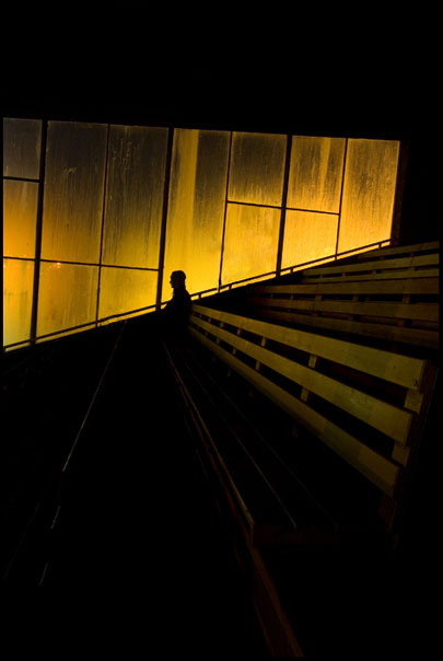
I see the idea, I think, but am distracted by the tilt of the composition and what seems to me to be random positioning of the figure. This one might have worked better straightened and cropped to put the figure on the rule of thirds IMO.
Excellent color. Great use of negative space. However, it could be best perhaps cropped in a horizontal/landscape fashion. I really dig the placement of the body and the way that lightest spot and all photo is directly above the person in the photo in the horizontal parallel lines pointing right at that person. This creates a lot of drama. Nice work.





 Add photograph to your favorites
 Add photographer to your favorites


 Photographer found comment helpful.


