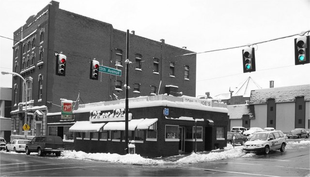
Hi. There are some things I really like about this photo, and then there are some things which I think could be better. First of all, I really like the black and white areas. The contrasts and detail looks good in B&W. I'm still wondering why you left some parts in colour? Is it because the diner is 70 years old, so thats B&W, and the colour things are newer? I'm not sure, but I don't really think the colour areas are very effective, and could possibly detract from a nice overall B&W photo.
The sky in this is very blown out, and just completly white. As this challenge was open editing, I think using a shorter shutter speed would have helped. This would allow you to get some detail in the sky, and if the buildings were too dark you could select them and edit them separately. You could then also burn the sky a bit to get some detail in there. I find sometimes adding a little grain can help make a sky more interesting, even if some people complain about it being noisey :)
The snow piled up around the diner looks really good. I think I would have been tempted to crop a little closer so more detail can be seen, and less of the not-si-interesting surroundings. I think that would also focus peoples attention more to the corner, which is what your title is doing.
Overall, nice conditions in a nice area make this a good photo, which could be improved by a little different editing, and moving in closer.
not sure the selective color adds much for me, unless there's maybe a reason behind it. the only thing i could think of is signs/signals, which could be nice.. but the restaurant signs appear to still be colorless.





 Add photograph to your favorites
 Add photographer to your favorites

 Photographer found comment helpful.


