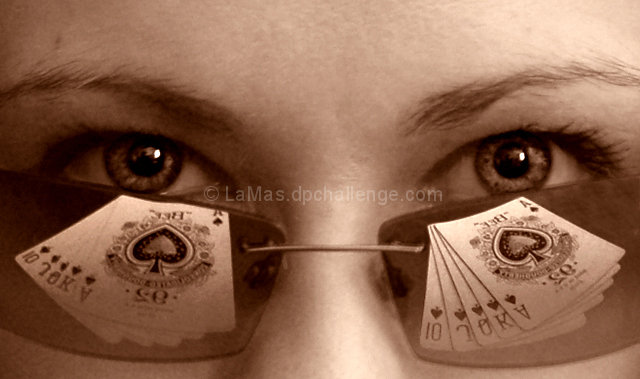
I had fun shooting this as it is the return of another sepia toned picture like I said before I love to do. I consider it the second in my series.
With the sepia tone I wanted to give it that western feel and to really give the overall coloring a similar tone to pop out the cards which are more of the main focus of the challenge. Below I havce two other variations of coloring black and white and original:
I did a basic crop with normal color and contrast level changes and then gave it the sepia tone using the color balance. I like to do my own version of the sepia tone rather than just a pre-selected filter. No advanced editing to get the cards as a double image. There were actually two identical sets laying in front of her. I soften the one side of her since I used natural light with a white paper reflector and lit the cards up a bit more using a silver reflector.
I hope you all enjoy this shot and I'll try to keep better with these photos.
Statistics
Place: 234 out of 383 Avg (all users): 5.2797 Avg (commenters): 6.2000 Avg (participants): 5.3412 Avg (non-participants): 5.1897 Views since voting: 935 Views during voting: 280 Votes: 143 Comments: 6 Favorites: 0
I really like your concept. I think that when you're in this close, though, the focus has to be razor sharp. Still would've been a 6 from me had I voted, but really sharp and I would've voted higher.





 Add photograph to your favorites
 Add photographer to your favorites


 Photographer found comment helpful.


