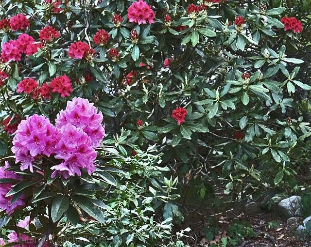
Tow colors of rhododendrons - fine. But your composition doesn't really say double to me - your subject roams around the left and top edge of the frame, and is lost by all the leaves. The viewer's eyes wander about aimlessly, end up on the rocks at the bottom right. crop tighter on the lush pink bloom in the foreground with the darker blooms behind, perhaps out of focus, but still this sort of composition would ask the viewer to contrast the two similar things.
Your photo seems to be lacking contrast and the empty space on the lower right of the frame draws attention away from the flowers. Maybe a shift to the the left would have helped or a tighter crop.
A closer crop would look better in this one. This doesn't seem to follow the Double Take criteria. Needs more contrast - looks a bit washed out on the monitor.
IMO this image is visually too busy. It would have been more dynamic if you had shot up close. The colors are pretty washed out too, probably due to the flat lighting. There is no real contrast. A bit more saturation and contrast in PP might have helped make the best of what your shooting day has given you (nobody controls the weather, right?).







 Add photograph to your favorites
 Add photographer to your favorites


 Photographer found comment helpful.


