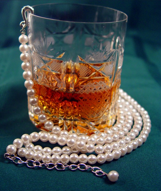
In my humble opinion, , , the pearls and the waterford crystal get the message accross but the alcohol, even if top shelf, my be conflicting to some viewers. Still life is nicely done. Good luck
Depth of field was little too narrow on this shot. And the glass is off-kilter, low to the right. Too bad you didn't get the words on the photo, like a poster - I know the directions were a little hazy on this.
the color of this bg doesn't really complement the subject. also your image is tilted form horizontal, giving it a sloppy feel. you could bring out more allure and glow in the liquor by backlighting a bit more as well.
This is an interesting image, but seems to me to be at variance with the text. Cheap pearls and bourbon don't really project an image of success in my mind.






 Add photograph to your favorites
 Add photographer to your favorites


 Photographer found comment helpful.


