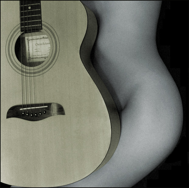
I received helpful feed-back on this photograph in the shapes contest. I went back and incorporated some of those suggestions. I used another exposure from the same shoot.
Statistics
Place: 61 out of 193 Avg (all users): 6.0452 Avg (commenters): 7.0769 Avg (participants): 5.9417 Avg (non-participants): 6.2025 Views since voting: 2749 Votes: 199 Comments: 15 Favorites: 4 (view)
Nice composition and comparison of curves. Two things come to mind: I think it might have looked better fully desaturated to grayscale. And somehow getting rid of the label in the guitar. Nice work overall.
I love the concept... the repetitious curves are wonderful. The BW / muted colors work well, although the yellows in the guitar are a little less saturated than I would have taken them (just personal preference, not a negative thing). The only thing that really bugs me here is the certificate inside the guitar.
JD
I think the guitar should have been held more straight, so the side is not seen, only the shape from the front. And then more covering the body so the shape of the guitar follows the flow of the body more.
Nice concept! Good composition repeating the shape of the guitar and the female figure. Its a bit grainy and perhaps a little overexposed in some areas. All b&w and cropping the bottom a bit to remove the black area in the left corner would make this more appealing for me.
The lovrly curves on the girl match the guitar beautifully. Love this shot, incluiding the grain. My favourite of the challenge so far (75% through them).
Very nice complementary curves,...but can you warm up the skin tones, she looks cold,...and the wood from the guitar would be better in a natural shade. Great shot though.







 Add photograph to your favorites
 Add photographer to your favorites

 Photographer found comment helpful.


