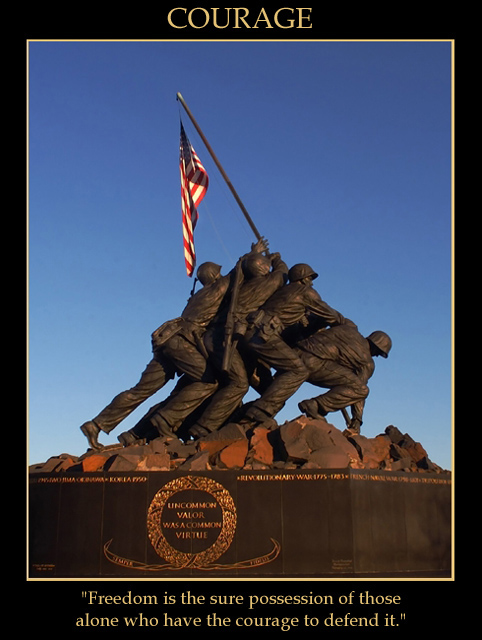
Greetings from the CC and happy new year. I think you did a good job of the poster part of this shot, the caption and border are visible yet not overbearing. I think the colour and lighting is also good, and tho generally i think a central compostion is a bit boring, i think for a poster type of shot it seems quite appropriate. I think the quote you chose provides the wow part of this image. Without it, i think,it might be a bit of a postcard.
The patriotic subject, is my only real critique of sorts. It has limited appeal, of course those with similar world views will appreciate it much more, however to the masses of people who see things differently your shot has little appeal IMO. Just something to consider. I would also like to be able to read the bottom of the monument. hope that gives you something to think about, and happy shooting!
Love the contrast in color - more subdued in sky and statue, pops the flag. Great capture, nicely framed, good selection of quote ( Pericles? ), nice font choice.
surely this is motivational. it's too bad we cannot read the fine print on the statue.
strong idea. this is also good timing, people will take to this.
I think this is a real commercial image (as far as I can judge....). You could sell it as a postcard in shops close to the monument. Perfect match between image and text.
Awsome light. Too bad the central inscription on the statue isn't centered in the frame. Personally I would have cropped higher so that we would have seen the stones under the soldiers feet without including the brown base with the gold lettering. I think this who have helped center the image better. Nice work!
Good use of a familiar symbol; good lighting, exposure, and color scheme. It's a little odd having the quotation on the monument readable, since it's different from your caption. In this one case, I might have considered blurring the type on the monument slightly.





 Add photograph to your favorites
 Add photographer to your favorites

 Photographer found comment helpful.


