Initial thoughts/My opinion Well thought of title and subject, composition too tight.
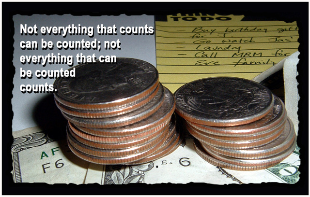
Content/Composition I think that the elements you put into your picture are well chosen, whereas the way you arranged them makes a problem. The stack of coins and the bills dominate the whole picture, whereas the non-countable things on the To-Do list are hard to get, although they should be more important IMO. Without the added text, you could have titled your submission also "Go for the money and leave the rest to others".
So a different arrangement including also some more space would have probably done better.
The picture has also some items that make it busy and somewhat "unclean": the white paper on which everything is place was not so well chosen, black would be better, at the right side one sees bended paper which attracts the viewers eyes because he/she wants to know what it is, but there is nothing. Finally the strong shadow from the left coin-stack bring in an element of unrest.
Speaking of shadow, light has to be addressed too. While it is not too harsh and the reflections on the coins wouldn't disturb much if they were not been shown so large, there is a gradient in the light from the lower front to the upper back. Again, this contradicts somehow the message you wanted to tell, i.e. the money should have better been placed in the dark and the text in the light.
Camera work -technically Focus is not too narrow, that's OK, however, as discussed above the focalpoint is set on the money instead of the "non-countable list". In an reversed composition, using a smaller DOF with blurred money might have been great. The light is too harsh, I suggest bouncing it first to a piece of paper or using natural daylight.
However, exposure is set right, just not used as compositional element as stated above.
Digital Processing - Technical No particular issue here regarding the image itself. The text is somehow squeezed into the edge.
The border is OK with me, you should only avoid that the border colour exactly matches with image parts close to the border. Here this happened with the black TO-DO List text in the upper right, making the border invisible.
Fits the challenge Of course it does and the selected topic is a very good one IMO.
Nice sentiment, nicely presented. The photo is clear and sharp, and well illustrates the text. IMHO it needs more light on the surface of the coins to bring out the metallic luster.
This is a very creative shot, and poster, it drifts from the normal borders I have seen. I like the font choice and color, it goes well with this shot, the message is very effective good job
I think your ideaand slogan was good. The light needed to be raised a bit to see the top of the coins. All your focus is on the dollar bills and the coins are a bit soft. Over all I like this shot.
Good idea and concept, but the poster is kind of very busy. The torn border makes it even messier and the text running into the coins throws it out of balance. The text could have been smaller and with gentler shadow. I don't know what kind of lighting you use, but the glare on the coins further distracts from the whole image. Sometimes it's good to place a thin piece of tissue paper between the lightsource and the subject to diffuse hard light. But you have a unique ideas, so don't give up.





 Add photograph to your favorites
 Add photographer to your favorites


 Photographer found comment helpful.


