Author Thread
Post actions
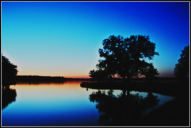
Perhaps a little too blue, but still very nice. Reminds me of this.
Comments Made During the Challenge
Post actions
The lovely blues are broken nicely by the slight lines of red/orange. That is effective. It seems tilted to the right to me, just a bit, though I understand that shorelines can give that illusion sometimes.
Post actions
love the colors and the strip of red along the horizion
Post actions
for me this has too much deep blue
Post actions
a bit too dark and static, even though it has some nice colors
Post actions
Oversaturated, and lacks good fill lighting..
Post actions
Very pretty colors & blending. I like the frame.
Post actions
Nice simple and rich primary colors.
Post actions
very peaceful scene, good composition. colours might be too oversaturated and I can see some dirt specks in the sky that you could have cloned out
Post actions
I don't mind the partial trees on both sides the excessive blue on the top right I find distracting and overall I find the shot to be just a bit too dark
Post actions
Now that is pretty. I love it. Great job.
Post actions
Colours are way overprocessed. They cyans are too overpowering.







 Add photograph to your favorites
 Add photographer to your favorites


 Photographer found comment helpful.


