I am scratching my head myself. I have no idea how did we managed to pull this off :-)) I am just very happy for Nick. It's a big encouragement for him to keep going. It gets him of the couch into the outdoors.
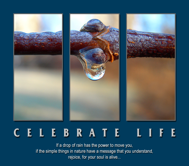
Nice work. I'm not crazy about the wide border or the color but that is minor. Your message is to Celebrate Life but to me the colors make it comes across as gloomy? The blue border the blur in the image. Still nice vote
First, let me say that I love everything about this entry except for not crediting Eleonora Duse with the original quote. It originally said "If a blade of grass has the power...".
Great image and outstanding photoshop composition. the split in three, the shadow behind image and text, the clarity of the image itself, it all adds to an outstanding poster.
Another beautiful motivational message and the image works very well indeed. I am not convinced by the decision to split the image into three panels not the drop shadow effect around each panel. Border colour and font choices work well.
This is a wonderful shot, the drop is so clear and your depth of field is perfect for this shot, I like the font and spacing in this shot,the message is wonderful, 10
Definitely one of the best in the challenge IMO. Love the separation of the 3 photos you have used. I really like the blue border and feel it adds something to the poster that plain black wouldn't have. Great quote as well. Good luck with the challenge!!!
Overall it's well presented, but the image should be powerful enough to stand on it's own, and I don't think that this one is. You're verging on too much text as well - the message should be more succinct.
I'm guessing that this might be the one in the forum that you were worried about. I won't vote it down, because its obvious you used just one picture. If you have no idea what I'm talking about, I apologize ;). I like the idea, and the foucus is great.
Ironically, dividing the picture into 3 parts emphasizes the simplicity of the subject. I think you picked an unusual background color, but I don't think I have a better suggestion either.
I like the main type, but I think I'd have used a slightly more calligraphic (but simple) font for the quotation.





 Celebrate life
 Add photograph to your favorites
 Add photographer to your favorites

 Photographer found comment helpful.


