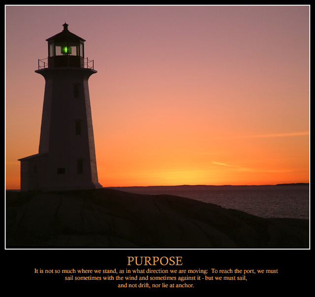
Shot of the Peggy's Cove lighthouse at dusk. Perfect evening for a shoot. Slightly cropped from original and colours modified using Hue / Saturation and Color Balance.
Had tons of fun with this one. The only thing missing is the border around the text that I couldn't figure out. Just didn't have the time to figure it out.
Statistics
Place: 6 out of 94 Avg (all users): 7.0795 Avg (commenters): 8.0000 Avg (participants): 6.8636 Avg (non-participants): 7.2091 Views since voting: 4557 Votes: 176 Comments: 28 Favorites: 0
I must say to start that this is a stunning image. The colours are magnificent and you have still managed to capture detail in the lighthouse and the rocks in the foreground rather then end up with a silhouette against the sunlit sky.
The square(ish) format suits the picture along with the white frame around it and the verse and picture go well together. I only have one problem - the horizon really spoils what could be a perfect picture. Given the December rule set and assuming the picture couldn't be taken again, a quick minor adjustment in PS could have done the trick...
It did the trick, but thanks anyway. Corrected crooked horizon and reframed with larger borders and text on two lines instead of three.
NOW available as a print!
I voted this a 9 and I am pleased for you that you achieved two ambitions
I have yet to crack the 7 even though I have achieved 4th
It's a beautiful photo and I guess the only reason it didnt win a ribbon is because there were a lot of amazing posters
Good luck to you in 2004
I must say to start that this is a stunning image. The colours are magnificent and you have still managed to capture detail in the lighthouse and the rocks in the foreground rather then end up with a silhouette against the sunlit sky.
The square(ish) format suits the picture along with the white frame around it and the verse and picture go well together. I only have one problem - the horizon really spoils what could be a perfect picture. Given the December rule set and assuming the picture couldn't be taken again, a quick minor adjustment in PS could have done the trick...
Very nice, one of my top rated. Do not like the white line around the photo, I think I would have chosen the same color as the font color, or very close. The white is somewhat distracting to me. I would also like to have seen the width of the black border be a bit wider.
One of the top ones! Like the metaphor of the lighthouse, it compliments the quote and the title. Minor suggestion - the font/size of the font for the quote could be bigger/kept to two lines/type set differently. Something about it is a smidge off. 9
Beautiful photo. I like the lighthouse as a not-quite-silhouette, with the windows discernable. Good composition and poster layout. A sailboat would have fit the text better.
Beautiful capture, great color, layout, borders, etc. Nice selection of font placement, size, etc. Great quote ( You should have given credit for that to Oliver Wendell Holmes ).
The is a gorgeous picture. love the colors and the quote is great too. Very nice poster layout IMO. Great as a picture on it's own and great as a poster too. Good luck with the challenge!!!
For me, too much text, with a title that's too small. Nice composition, though I'd like to have seen more light on the lighthouse and a straighter horizon. Given the flexibility of the December rule set, I'd also have changed the color of the green beacon as it distracts a little.
Beautiful, simple, clean. Stands out from some of the more busier posters. Colours are very nice, lovely contrast. Border OK. The text (the main word) could have been a bit larger (but just a tiny bit). You've done great job with this.





 Add photograph to your favorites
 Add photographer to your favorites


 Photographer found comment helpful.


