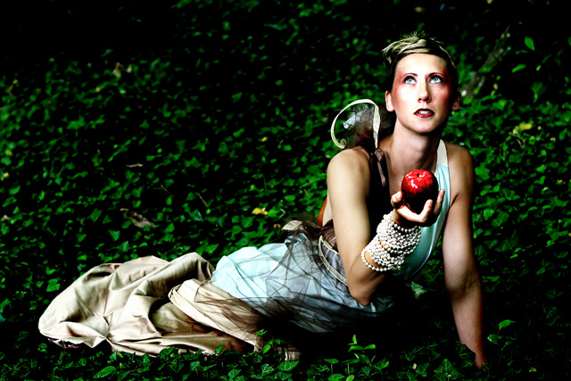
I'm a huge fan of over editing but this just isn't working for me. It may be that the intensity of the colours in combination with the apple, pearls, netting wrapped around her and the leaves make so much texture, that I'm yearning for a simpler finish. To me, it would be killer in black and white. Not bad by any means (in my eye) but maybe a bit too busy when you combine the intense tones and various textures. 6 from me.
I think there's too much going on with the model. She's wrapped in a sheet.. and the black netting.. and two strings of pears.. and whatever is on her shoulder.. and she has a lot of makeup. The photo as a whole looks overprocessed too. Looks like you bumped up your contrast which blew out your reds. Lost all detail in the apple.
this is nice creative - and well executed from the shoot standpoint - but the processing with all of those crushing blacks is stomping the life right out of this one. I'd recommend a little lighter hand on the processing to let your really really nice work shine through.






 Add photograph to your favorites
 Add photographer to your favorites


