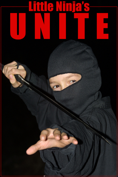
A good idea and a lovely model but his eyes are almost laughing, to me a ninja, large or small should have more intense eyes. Also the cropping just leaves me feeling a bit closed in, maybe if it was loosened up just a tad, a very small tad. Started with a 4, am raising to a 6
Need to see the blade, lighting could be more subtle, Ninja's work in dark shadows, stealthy, change that. The word Unite is too big, Shorten its height across the same width area. Good idea though.
Looks like a movie poster! With the Dec rules in place, I would have cloned out that little spec of color at the bottom near the red border. Its distracting.
Composition is good, concept ok, but how is it supposed to motivate me? The word UNITE could have been a bit smaller (less tall). Too bad the front hand is not in focus as the rest of the image is. If this is a child's shot - well done. If it is an adult who created this - keep trying.






 Add photograph to your favorites
 Add photographer to your favorites


 Photographer found comment helpful.


