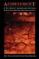
I like it how the eye pops out and the red vs dark tones.
The lighting is very good and the exposure matches that.
Skink color is very good and I guess therefore that the hair color and nice contrasty but undisturbing background color is spot on as well.
The composition is very good, good use of dof and a some strong leading lines with the lighting higlight on the eye area. 9
I really like this photo - the angle of the portrait, the colors, the focus, the depth of field - well, everything about it. I can easily see this on a magazine cover. I also like the imbedding of the text into the photo and in just the right color and intensity. One of the best in this challenge.
Great shot, this is very interesting, your model choice works wonderfully with the motivational message , the hair and the wonderful expression on her face great job in my opinion.
Love this Picture! This is just awesome! Awesome composition and excellent lighting. Makes me wonder why I can't produce pictures like this. :-) Just something about this photo really grabs and keeps my interest. From what I have seen so far this is my favorite. Good luck with the challenge!!!
Too bad the "i" of "is" is overlapping the fur trim of her hood. Love the angle of the capture and lighting is quite good also. DOF is just a teeny bit too shallow. The hair on her right below the chin looks fuzzy and the edge of the hood on her right looks "off" because of it.
Nice image. I'd have liked to have seen more of her face though. The overall concept is a little vague though, where a motivational poster needs to be instantly understandable.
I really like the way I am drawn to the face and the eye. Great contrast of the red hair and the grey coat. Photo is very well done, the text could have been a tiny bit smaller and along the bottom. On the top as it is, it throws the image a bit out of kilt. Otherwise well done.







 Add photograph to your favorites
 Add photographer to your favorites


 Photographer found comment helpful.


