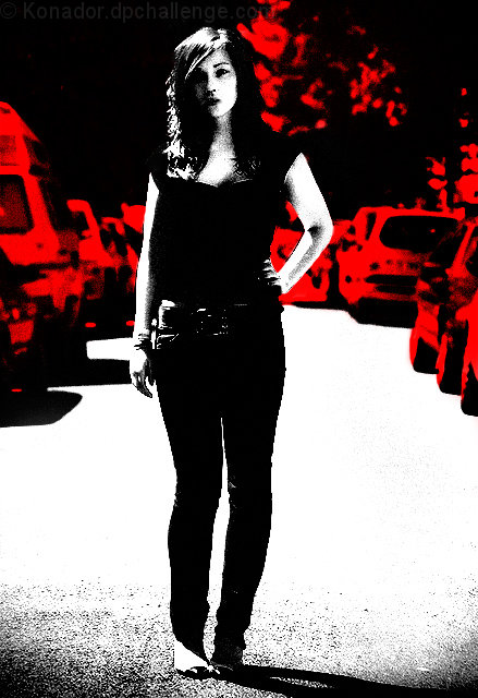
I quite liked the photo originally, but I thought I might experiment with some different editing styles - ones that I know will do terribly on DPC. I'm predicting a sub-4 score here, but I really really like it.
Statistics
Place: 375 out of 617 Avg (all users): 5.4663 Avg (commenters): 6.6111 Avg (participants): 5.4922 Avg (non-participants): 5.3714 Views since voting: 1683 Views during voting: 249 Votes: 163 Comments: 24 Favorites: 1 (view)
Won't appeal to everyone but I think it's spectacular. Her nonchalant, indifferent pose and expression are perfectly matched to the grainy textures and stark BW appearance. The way her hair seems to blend into the dark negative space at left is perfect. This one goes directly into the faves and I'll be back to see who pulled this off after the challenge. Congrats!
This is different and neat looking. I know how you did it because I have done it before by accident but never thought about entering it into a challenge. After seeing yours I think I will do it again and try it.
i reckon this is a daring move being so highly and obviously processed, but I LOVE IT ... love the processing, the girls posture, her expression and the scene .. i also love black and red which are my favourite colours!!! .. this is just excellent .. your choice with the selected areas of white just make this superb ... =10
This does have a lovely pop art feeling to it, loving the reds and the blacks (shades of Che Guevara poster), feels like it should be a book cover or poster







 Add photograph to your favorites
 Add photographer to your favorites

 Photographer found comment helpful.


