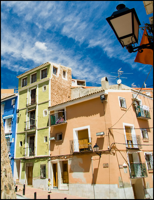
nice colors of sky contrasted against the colors of the buildings, beyond that though it gets cluttered up quickly. the wall on the L and the light in the upper R are distracting. better overall quality of light would help too
Intersting and 'colorful' photo. Love the crisp lines and angles...wish the midtones were stronger though, and I'm not too sure about the building on the lefthand side.
I like the clarity, colours and sharpness (though a little less sharp at the bottom, due to lens distortion, I guess). It looks kind of Mediterranean, but may be Portugal.
(vote 43)
I think the only thing that really looks good to me here is the sky.
Sorry don't take it personal but there is way too much wrong with this picture.
For starters the lamp pole...
The rock or whatever that is on the left side, these are very distraction and I bet your getting nailed for them (if people are even commenting on them)
The blue, green and peach is okay but the buildings have way too much going on with them for 1 thing to really stand out. You have power lines in the shot too.
I'm sure you had really great expectations for this shot but Sorry it's just not all that good. Read some how to's and get some idea's from others. That's how I am learning... And BTW I am NO expert at this... You can tell from all my ribbons, hehehe. Good luck...






 Add photograph to your favorites
 Add photographer to your favorites


 Photographer found comment helpful.


