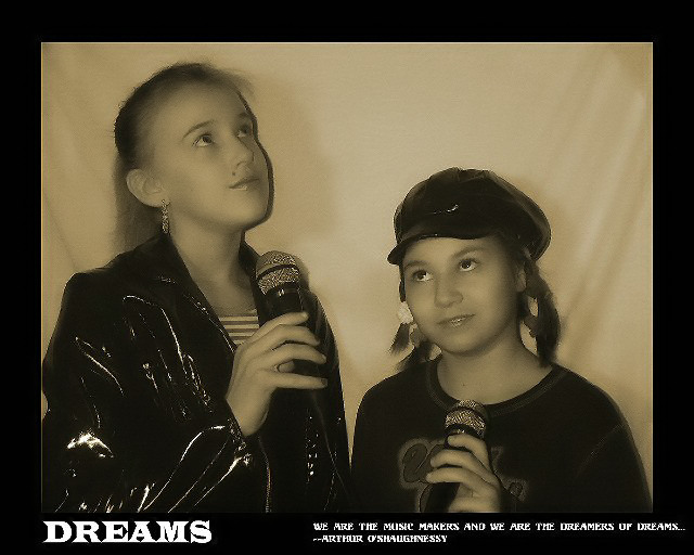
Personally I do not like the wide border on all sides. The tesxt is to small for my old eyes to read. The white balance seems to be off a tad. Nice idea and shot with all things considered.
Wonderful photo. Soft and dreamy. A few technical problems (glare on the taller girl's jacket and lots of artifacts from low quality JPEG compression). I don't like the composition of the overall poster; cramming words into the bottom margin just doesn't work. The top and side margins are great, but the bottom needs about twice as much, and the quote needs to be right justified with the right edge of the photo. The letters in the quote are garbled, but I think this is due to the same compression artifacts that plague the photo. DPChallenge allows files up to 150K, so a higher quality compression setting can be used to avoid these.
Cute photo of the girls, but it has some bad yellow cast. If you intended a tone in you image, more warmer tone would have been more pleasing with this subject. This cast makes them look jaundiced. The word Dreams is OK, but the smaller text is illegible. If you didn't use all caps, it would have been more clear.







 Add photograph to your favorites
 Add photographer to your favorites


 Photographer found comment helpful.


