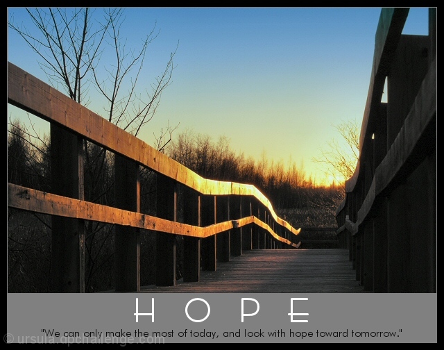
The picture itself is edited within the old rules (contrast, saturation, whatever), except that I added a layer, coloured the layer in a gradient from medium blue to transparent, and blended in darken mode at about 50% (to even out the exposure between sky and boardwalk).
I resized the picture, sharpened, added grey and black borders, then added the words.
This is such a corny poster :)) I almost got sick looking at "motivational posters" to get more or less inspired for the challenge.
Statistics
Place: 24 out of 94 Avg (all users): 6.4560 Avg (commenters): 7.6154 Avg (participants): 6.3788 Avg (non-participants): 6.5000 Views since voting: 1989 Votes: 182 Comments: 14 Favorites: 1 (view)
Hi Ursula,
A very technically sound photograph. Your timing (Sun), Your setup position here hit the mark (Nailed it). I don't think the photograph would have had as much impact in any other position. Your choice in using the bridges guard rails as your leading lines entering and exiting the photograph are also very well done. The details through out the entire photograph are to be commended especially on the shadowed side of the guard rails. These could have gone over looked and lost without anyone really noticing (my complements) on this point. I really like the balance in the light & shadow's ties in very well with the concept of the photograph kind of like the good (sun) & evil (shadow). The low tight angle here gives the photograph great depth, looks like your looking out for miles (excellent). Your position relative to the bridge and the tree give the photograph a marvelous sence of scale. I also like the way you caught the reflection from the guard rails down onto the bridge planks (caught light) if you will giving us the details in the planking. The sky portion of the photograph is also well done, I very much like the way the color mells together here from the nice golden into the blue. The Cloudless sky works extremely well here, in fact I think a cloud or anything in the sky here would have actully hurt in this instance. The use of your title & text here work real well here tieing the whole photograph together. If there was anything I would have considered here and it would be just that was the words being done in the golden color of the sky blending the entire photograph into one. Over all this was a well thought out, well composed photograph. This is a sellable photograph !!!. Would love to see this shot in both color and B&W with snow. Again my complements on this photograph know dout taken by someone that loves photography and takes pride in her work. Again VERY WELL DONE.
I am really into bridges, so this one is in my top list. Wonderful perspective and the glow it has ads additional touch to the hope. I also like the text very much (the font selection). Very well done.






 Add photograph to your favorites
 Add photographer to your favorites

 Photographer found comment helpful.


