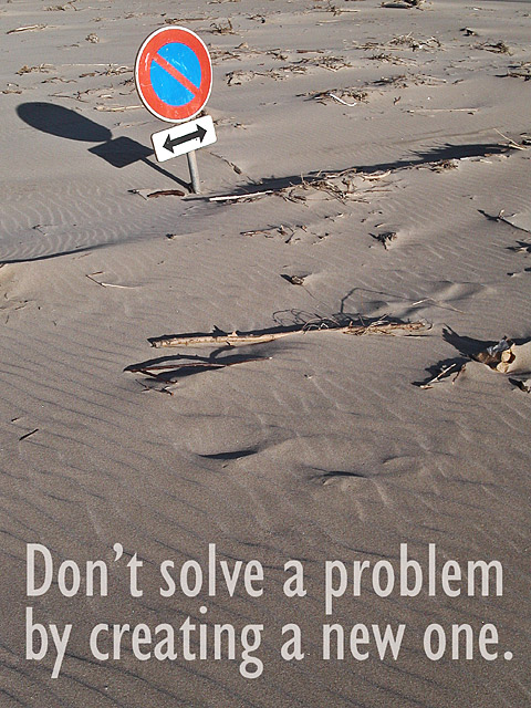
Interesting textures and shapes. The sign is a bit close to the top, but is still the obvious center of interest. I'm not sure what it means, so don't really understand the allusion to creating a new problem. The sharpness is great except for the sign's shadow, which has a halo I'm guessing is from oversharpening; since spot editing was allowed for this challenge it would have been nice to avoid that.
Nicely done. Text font/etc looks spot on. Might have chosen a slightly lighter colour? The sign is a little out of the pic, but I don't think that's a bad thing. Nice amount of texture and detail.
One of my top picks. I love the humor of this shot. My only suggesion would be to have a tiny big more space on the top and less on the bottom which would bring the text up a bit. The shot has a great perspective and sharpness. Well done.





 Add photograph to your favorites
 Add photographer to your favorites

 Photographer found comment helpful.


