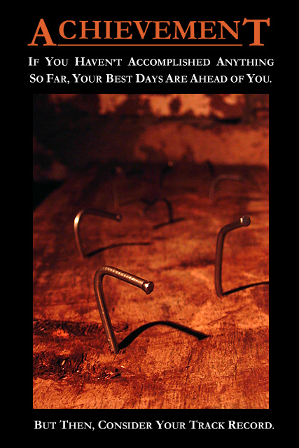
Hi and grettings from the CC. I like your funny take on this shot, and I think the poster part of this shot was well done also. I think the highlight of this shot is your master of the DOF, I like the first nail and the shadows that go with it. I think I would prefer the left top and back cropped a bit more. Although I think the composition of the nails is interesting. The lighting and colors are warm and inviting to a subject that is not that friendly creating a nice tension in your shot, helping to add to the humor of the posters overall feel.
Well done shot!
keep it up, happy shooting.
Thanks dsidwell, and all others during the challenge.
Strangely enough, this was the 'least set-up' of all the shots I took. I was planning on having a single straight nail in the foreground, with the bent ones in the background. I took quite a few shots with my MX600Z, and then moved aside for a friend to try with his Olympus C5050. In between his shots, I placed my MX600Z on the wood, behind the straight nail, braced against the wood and the nail, and took a shot. What do you know, it turned out the best of the lot!
I did this in an earlier challenge, so I do it here as well - answer some of the questions and address some of the statements made in the comments during the challenge:
'This is not motivational...'/'...more de-motivational'. It's a 'de-motivational' poster, intentionally. Demotivators can motivate too! As per www.despair.com's motto, 'Increasing success by lowering expectations'.
'...little too much shadow top left' / '...upper part of the image is a bit messy' Maybe. I rather liked the wall in the very background, so I didnt crop the top, and I couldnt crop the left without affecting the position of the front nail.
'Too much text, idea copied directly from www.despair.com'. The style is copied from despair.com, intentionally. I changed it a bit by putting the 'kicker' text at the bottom. No, the idea wasnt copied, though. It wasnt until you mentioned it that I searched despair.com and saw the similar shot (Incompetence). The idea came to me after finding the phrase on a Dilbert quote site.
'Not sure about the color of your title tho / the text in all caps is not as simple to read as regular text would be'. The color was 'eye-dropped' from the wood, but looking back, maybe you're right, a bit too 'orangy'. I made it 'redder' in the printable version. The 'all-caps' text is the same style as despair.com use, and I wanted to stick with that style as much as possible.
'the poster will be ven powerful if the picture is also double framed with a thin line' despair.com use a single frame line around the picture. I was trying for that, but couldnt get it done properly (I havent used PS much yet). I added a line in the printable version.
Thank you all again for taking the time to comment.
Great abstract, it's a negative motivation so it needs a degree of positive motivation; another statement for this can be "Practice" -- and progressively do better from back to front.
You really ruined teh best shot in the whole contest with a half assed attempt at humor.
what? did he just say that? he didn't!
yes he did!
Just kidding- great shot! :)
This is very www.despair.com! I like it! My only negative point would be that there is a little too much shadow in the top left corner of the image which makes it merge into the border a little too much. But a great image choice and message!
Fantastic. This one hit a personal note. As a youngster I was building a dog house. My senior neighbor, who was waching over the fence, critiqued my hammering skills with, "The wind must be blowing hard today." I like your thoughts much, much better!
Too much text, and the idea is copied directly from a similar image at www.depair.com. The photo could do with having more detail, and the upper part of the image is a bit messy. Nice strong colors though.
Great poster. Love the photo. Not so sure about the colour of your title though. It somehow doesn't match the red tone of your photo, it's a bit off. Also something to consider, the text in all caps is not as simple to read as regular text would be.






 Add photograph to your favorites
 Add photographer to your favorites

 Photographer found comment helpful.


