Personnaly, I don't like the box around the title/quote. It chops off part of the photo but then there's a vine hanging on below the words pulling my eye down there. Not sure but I think I would have cropped out the tree. Otherwise, very interesting photo that nails the quote. Simple and impactful
excellent, but a couple things that i've noticed. 1) not sure that the soft edges do much for me 2) there seems to be a horizontal white line at the bottom sides of the poster.. not sure if this was intentional, but think it would be better without it 3) fence seems just slightly uneven with horizontal. still, a great photo with an even better motivational message.
Nice- maybe a little much with the phrase under adapt. That word alone speaks volumes- I love the green on white you have going on here. You must be in a warm and sunny place! I don't like the feathered border.
Interesting idea, and an interesting illustration. Is there a reason that one plant is going around obstacles and the other is managing to grow straight up?
Nicely done. I like all the white and the text. Not sure why the banner is raised..but it's okay. I think the green could of had a saturation boost. ?just my opinion.
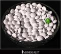
Nice concept and shot. Fits perfectly with the challenge and with the text. But I would have put the text completely to the bottom of the poster. This way it kind of floats. Also the border is somehow not fitting with this image, either have a soft border or a hard one. Combining both creates unbalance to me.






 Add photograph to your favorites
 Add photographer to your favorites


 Photographer found comment helpful.


