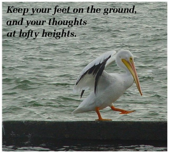
Great pose! The text helps balance the composition; without them the bird would be too far to the right. (Even with them, a bit more space on the right would be helpful, but not as critical.) Some sharpening might be helpful, and I think a black border would work better than a white one; it would help bring out the text and the black feathers better.
This is great shot. The text fits well with the theme of the photo. The colours are kind of drabby and the image is a bit grainy. Composition is good, could be a bit brighter. In this case it was not such a good idea to put the text up on the top, it kind of creates unbalance. It would have been nicer reversed on the bottom over the dark part masking some of the messiness of the deck.





 Add photograph to your favorites
 Add photographer to your favorites


 Photographer found comment helpful.


