Terry, once again I get the pleasure of critiquing one of your shots!
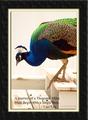
Photograph: This is a very nice shot of the bird. It's very easy to take a shot of a duck. It's not so easy to get a nice shot of a duck as well composed, going right where you want it, with the focus right on, and with such a nice reflection. Great detail in the feathers too! My only complaint (and it's a personal preference) is the shallow DOF. In this case your choice is probably better than mine would be. You have in focus all the detail you need for your message. I just happen to love the detail in the ripples in a large body of water.
Poster: You have a beautiful message and do a wonderful job of conveying it, both in photo and in text. I love the border that you chose here! Your choice of font color however is too close to some of the colors inherent in the waters reflections. This makes the text on the right side a little hard to read.
Overall: A very nice job of taking a message and presenting it in a poster type format!
Like the boarder, quote, and title. Only criticism is the words on the far right blend into the lighter refection and draw my eye away from the subject.
Beautiful photograph; great color saturation, sharp focus on the bird with nice depth of field to lead into it. I really like the use of the inner line as a border instead of a wide black outside border. My only criticism ( and I don't know how I would have done it differently ) is that the text gets a little bit lost on the right hand side due to the colors in the image.
Fantastic colour of the water. I hope that's real! I'm not at all keen on the text however, sorry. Especially on the words "Reflection" and "words" at the end it's very difficult to read. I would have been tempted to use a solid border. Good effort.
This is really gorgeous. The one thing I'd change, however, would be to make the smaller text upper/lower case. I come from a background of typography, and it is proven that upper/lower mix is easier to read than all caps.
Gorgeous photo and reflection. Love the colours and the composition is very good. I do not like the text in all caps, as it is very hard to read. Sometimes it is a good technique to darken the background behind the text a bit with a faded layer to make the text stand out from the busy background. This actually looks like a pro poster and I like it over all.






 Add photograph to your favorites
 Add photographer to your favorites


