Author Thread Comments Made During the Challenge
Post actions
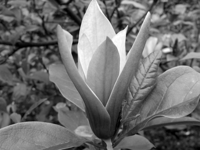
i think that this would have looked better in color
Post actions
the tones are pretty good here but I think it really needs more contrast and some adjustment of levels to get the whites and blacks more pronounced
Post actions
Be careful of composing / cropping with your main focal point so dead-center.
Post actions
a little more off of the right would have made this composition stronger, I think, and while the light "within" is nice, the plant itself seems to be kinda "gray," maybe a boost in contrast to give you a broader tonal range would help
Post actions
Could use a touch of burning but other than that it looks good.
Post actions
Very pretty..there are some white spots on the leaf to the right that could be touched up but good job.
Post actions
appears flat on my monitor, I feel sorry for the two leaves that were cut off, the background looks very busy
Post actions
Post actions
This is very pretty. Good job. :)
Post actions
this could use a boost in contrast to really make the flower pop from the background
Post actions
Needs some more contrast.
Post actions
I somehow have a feeling that this pic would have been nicer in color






 Add photograph to your favorites
 Add photographer to your favorites


 Photographer found comment helpful.


