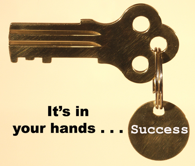
An Alcatraz souvenir. . . with a more positive motivation!
Hung the key against a white backround; adjusted the color and brightness for the background; dissolved the support lines from view. Sharpened the key, added the wording and cropped for submission. Touched up the edges of the key with the healing tool. Tried to keep it very simple and direct.
Statistics
Place: 51 out of 94 Avg (all users): 5.5480 Avg (commenters): 6.4167 Avg (participants): 5.5588 Avg (non-participants): 5.5413 Views since voting: 1634 Votes: 177 Comments: 16 Favorites: 1 (view)
This was a good concept for a motivational poster but is an image that isn't as strong as it might be. Much of this comes from the background which (on my monitor) comes across as uneven, a cream to a yellowish pinkish tone, on the left. This color doesn't set off the bronze of the key and key ring as well as another might have. The key itself seems truncated, and lacking in teeth. The hanging disc has a different font and that is startling - perhaps all text might do better in the same color. The disc also has a nick on the upper right edge that catches the eye and moves it away from your message. There also are some small flares of light that I am sure you are aware of. All of the above being said, the composition is simple and helps to support the message. Textures and clarity are good and the whole image would have some real impact if it were warmed up a bit. Thanks for the image.
That key isn't going to do much for me. Use a key with more pronounced teeth or represents something with more passion, inspiration, or unlocks something much more worthwile.
Looks more like a late night commercial than a poster?
I don't like the yellowish background.
Could really be improved upon.
Let us see it if you do another shot at it.
Simple but effective composition. Well chosen elements and good lighting. The font used for "Success" doesn't work well with the font used for the rest of the text.
What a clever idea - I like the way the image really is key to the message (no pun intended!). A really unusual idea! Not keen on the font of the word Success - was that already enamelled onto the keyring or added by you?
Very clever idea. LIke the composition and design. The only thing I am not so sure about is the yellowish cast the whole image has. Otherwise well done.







 Add photograph to your favorites
 Add photographer to your favorites


 Photographer found comment helpful.


