*Critique Club* :0)
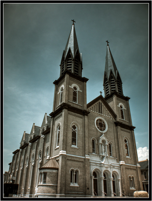
While the exposure on this is excellent and the tones lovely I find it distracting that the bottom of the church has been cut off. I don't know if it's your filter that make the towers look almost metallic but it's cool. Also the image doesn't seem sharp to me. I can never really tell if it just might need some sharpening in post processing or in camera but either way sharper would be nicer here...
This would look awesome as a metallic print!!!
|






 Add photograph to your favorites
 Add photographer to your favorites

 Photographer found comment helpful.


