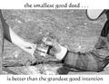
Fabulous photo, choice of borders and colors works for me; don't particularly care for the typography at the top - I'm not sure if it's the font choice, or the bullets that separate the lettering, but I'm not crazy about that part. The look on that child's face is adorable!
One of my favorite quotes (would like to see the attribution) Nice composition and black/white/red color selection. Light on the back of man's head draws too much attention -- makes him look "cut out and pasted on" Like the triple boarder.
I like the picture as it is , the border and the color of the text spoil the overall effect ... I would love to see this image with black text and a simple black frame . Maybe the the lighting of the persons head from the back was not a good idea ...just the lighting from the front would suffice ?
I love the message. I'm not thrilled with the color of the text or the border. With the Dec rules in place, I would have cloned out the far collar, its a little distracting. And, I think you could have removed a bit more of the white around the fathers hairline to make it look less pasted into the black background.
Tha baby looks really freaked out! I'm sorry, it just distracts from everything else. It also looks like a cut and paste job of the portrait onto the background, resulting in a very artificial image. For a motivational poster, this has too much text.
Excellent quote, interesting image - a little soft on focus. Both the adult and child look so serious. I personally would like to see this with a little more "playful" image.
The message is very motivational! The edge around the guy's back and head looks very cut and paste. The border could have done without the thick white part.
The message of this poster is really beautiful. But here are my suggestions: when you edit background out of an image, make sure you adjust the remaining portions to the new background. The head of the man needs a contrast adjustment to make it appear more natural. Also the baby (IMO the main subject of this shot) should be more in focus. I understand you tried hard to make it appear as a pro poster, but IMO too many borders are simply too many - simplify.






 Add photograph to your favorites
 Add photographer to your favorites


 Photographer found comment helpful.


