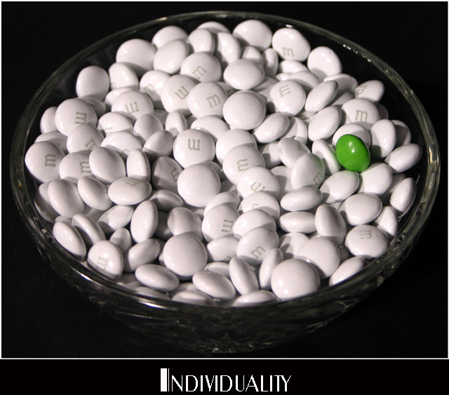
Nice interpretation; great expression of the catchword. I don't care much for the font that was selected, as it takes focus off the candy, and I think that the overall effect might be improved if the thin white frame was left out - just let the black have control to give even more accent to the white M&M's.
Creative! The lighting works surprisingly well; generally double shadows should be avoided, but here it adds to the overall confusion and anonymity of the white candies. The overall poster seems a bit crowded; either remove the white border or put space around it. The aliasing in the font may be part of its individuality, but I find it distracting.
When you enhance or colorise the M&M pay careful attention to the surrounding white M&Ms as they will invariably reflect the green one. This shot looks very retouched, but with a little work could look perfect. Now you'll probably tell me it is a straight shot and I'll have to eat my hat (prefereable to eating the M&Ms!)
I like this idea, the only thing i´m not happy with is where you put the green one, i wouldn´t have put it in the middle, but a little lower and nearer the middle.
Love the idea and the white M&M's are very cool. I don't like the 'text' you picked. The photo is good and the idea is very good for this challenge. Did you try it with the candy just on the table without the bowl?
Wow, I've never seen white M&Ms before. Cute concept. Simple colour with good effect. It's a bit too tightly cropped for my taste and more space around the text would have helped. It feels tiny bit claustrophobic.
Very nice! I love this kind of 'bucking the system' photographs. Your choice of colors is great and with the black background ... the effect is dramatic.





 Add photograph to your favorites
 Add photographer to your favorites


 Photographer found comment helpful.


