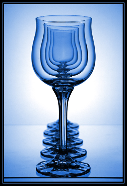
Neat illusion, love the cool tones too, lighting is great. Two nitpicks - as this was advanced rules I personally would have cloned out the lines where the paper met to give it more fluidity, and I have no idea what's with the line at the front, not fond of it. Overall it's a great shot!
interesting photograph. I really like the idea and compostion. I'm not too sure about the bottom border because it takes my eye there too much instead of taking the whole photo in. I give it high marks for everything else
Beautiful abstract composition. Would like it if the bottom of the table was cropped out. It kind of distracts from the whole shot. Great job lighting , brings out the reflections beautifully.
hmmm ... have I seen these glasses before? Arranged differently? Nice. One nitpick: the line below the glasses - it would be nice if it weren't there (free edit challenge, you could clone it out :)
I think it is very good, but not perfect. I like the soft edge definition of the glass with the darker blue, and I like the overall color tones and I like how clean the image is. Good overall appeal. The edge definition of the second glass is a bit dark on the right hand side and the line-up of the fourth glass is not perfect, it is a bit too far to the left. I would have tried to remove the edges of the table, both in front and at the back, Since you are using a light from the back through a translucent background a piece of semi-transparent paper flowing from the table on to the background might have done the trick.
Neat trick. Lines at the bottom of frame and where background edges meet are a shame, and there seem to be one or two markes that could happily have been cloned out. Like the colour, and your handling of light is an object lesson.
These glasses look sooooooooooooo familier, I wonder, LOL! :)
I love this shot, very inventive and creative. The lighting is excellent and I love the set up but the black line across the bottom is a bit distracting to me. Started with an 8, going to a 9, would be a 10 without that line ;(
Really nice shot. At first I thought it might have benefited from cropping the bases out but now I sort of think that it helps to ground the image and help the viewer understand the shot. What I don't like is the dark line right under the front glass. I'm tipping I'm not the first to mention it. Get rid of the line and I think the shot would be first class. Good Luck, Todd. 8.
Waiting for this image to download I was really impressed with it, but when it got to the bottom and the big black line goes across at the base of the glasses it really spoiled it...
Looking more closely at the glassses, on the front glass, right hand side there looks to be a dirty mark that could easily have been cloned out.
The idea, the colours, how it's lined up, the lighting etc are all brilliant, but this spoils it. 7
Nice shot. Perfectly centered. This looks like Spanish Grease's work. Saw the exact same thing by another photographer on Photosig.com two days ago, but not holding that against you. Nice colour. Too bad about the edge of the glass pane at the bottom of the shot. I realize that you couldn't crop it out because it would have been too tight at the bottom. The far edge of the glass pane could have been cloned out to give a more seamless look and could have taken care of that smudge on the front glass.
This is a great effect and the blue tones are really nice. I love it, but for the line across the bottom, for some reason I find it just a tad distracting but it's still and 8 from me! Great!
I recognise this -- its a parody of a shot by John Freeman in a book he reacently wrote. You should have taken more care lining up the glasses and kept them away from the edge of the table. You even seem to have copied the black card on either side of the glasses. No originality unfortunately, and only a moderate reproduction.
Sharp, nice colors (Like the original) and not too much noise. Had I not seen it before and apart from the lack of care lining up the glasses you would have got 7 or 8. I do however hate copies so sorry but 5.
My appologies if you had not seen mr. Freemans picture.
Edit: --
in retrospect it has occurred to me that many people do well on the site with parody photographs. Therefore my initial opinion was a little bit harsh, and I have changed your vote to a six.
I have also check again on the original that I saw, and it had a white background so I do quite like your blue background as it complements the glasses quite well. The top of your front most glasses also has a slightly uneven edge at the top of it, and this does draw your eye towards it -- which is a little bit distracting.
In order to line the classes up better I would recommend using two rulers on the bases of the glasses so that you can guarantee that they are straight.
Overall a very good picture.
This is the EXACT idea I had for a previous challenge! I have one minor problem with this image and it's the edge of the table or whatnot at the end of the glasses. Otherwise one of the best images in this challenge!
Neat effect. I like the blue here, but I would remove the horizontal line in the foreground. It just keeps pulling my eye away from the art. It is good work and I'm giving it high marks.





 Add photograph to your favorites
 Add photographer to your favorites

 Photographer found comment helpful.


