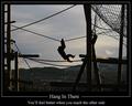
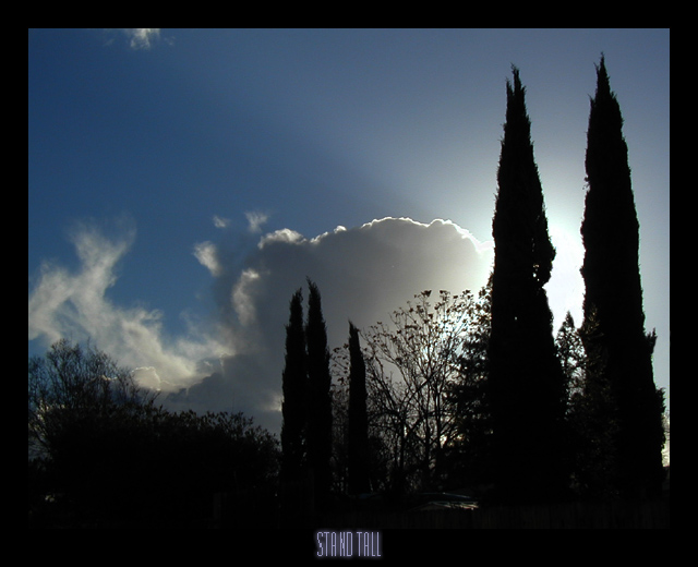
I find this image contains elements which are both calming and
tension-inducing, which I feel go along with the theme. Standing tall is
something one is usually reminded to do in the face of adversity, but is
(to me anyway) as much a call for calm, rational solutions as a call to
action.
Used one curve for overall contrast. Cloned out a few branches between the main trees to make a clearer
division. Resized, sharpened a little, added the border and type
(font=Emperor NineTeen Regular, 28 points at this scale), added some outer glow and inner shadow for smoothing and texture.
Statistics
Place: 45 out of 94 Avg (all users): 5.8000 Avg (commenters): 5.1250 Avg (participants): 5.4844 Avg (non-participants): 5.9906 Views since voting: 2111 Votes: 170 Comments: 9 Favorites: 0
hi and happy new year! lynn from the CC here, I am intimidated givng thoughts on a SC members shot : ) and I am new at this.. but here goes my thoughts...While I like silhoutted type shots, what I think this one is missing(my biggest criticism) is a little is detail in the dark areas, I think if you are going to have your main subject 'blackened' it is nice if there is lots of detail to highlight the shapes to make it really jump. So perhaps using a subject of a kind of tree that is a little more 'branchy?' just an idea. This shot however does have (the highlight of this shot which IMO), is the beautiful light coming from behind the cloud/tree. The bright edge of the cloud is lovely too. I would like to see the left side cropped a little tighter. I do like that your title and border are more subtle still in nature, hence not distracting from the image. BTW I agree with you that the shot has tensions in it, which I also like. Happy shooting : ), hope it helped a little.
Very good. I think a very small white border would have set the image out more. It blends right into the black border. The text seems small and cramped> I Feel you were after the tall effect but I think it could have been better. Nice job!
Nice idea, though could have been more dramatic if you could have found a better-lit subject. Photographically, it seems to just be a metering error - unless you were going for this look. The titie is a little too small to work effectively.





 Add photograph to your favorites
 Add photographer to your favorites


 Photographer found comment helpful.


