Author Thread Comments Made During the Challenge
Post actions
Very nice picture -- great use of lighting.
Post actions
One of my top 3. Light, angle and subject come together flawlessly. Great Job! Good Luck!
Post actions
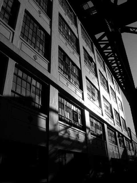
Very dramatic. Everything just grows out of the shadows, and all the lines lead to the light. Nice work.
Post actions
Interesting and fine detail. I would have cropped the bottom part out though.
Post actions
I particularly like the depth perception and offset horizon in this photo... not to mention that i love black and white... Kudos to the photographer!
Post actions
A little too dark for my tastes, yet stirringly effective.
Post actions
Post actions
I would have tried to crop off more at the bottom. There isn't much going on there.
Post actions
nice, perhaps a little too dark tho
Post actions
I love it - there is an eerieness and yet serenity to the picture
Post actions
Amazing shot! great use of monochrome here, along with the play of shadows.
Post actions
classic black and white/ industrial shot. Great converging lines. Seems tilted slightly though.
Post actions
love the lighting and the shadows and the use of black and white. All good choices. And the angle is dynamic.
Post actions
Can't tell you why, but I find it has a strong mood.
Post actions
Nice composition I like your use of light
Post actions
Very nice. Love the b&w.....cold looking.
Post actions
I like this picture. Maby a bit more contrast would make it perfect. I think it looks better if you flip it horizontal.
Post actions
Post actions
good shot - shadows at base detract.
Post actions
i really like the shadows and angle on this photo. seems a tad underexposed in areas, but i think you'd risk blowing out the right side of the building with more exposure.
Post actions
i like theq industrial film noir look to this
Post actions
Very nicely done. Initially looking at it, I thought it was inside, maybe in a library, but after staring at it for awhile, I think it's outside. All the same, it's a great how.
Post actions
Post actions
Lovely shadows, great perspective.
Post actions
just a touch too blown-out, if it were just the windows it'd look better, but too much of the wall's detail is lost.
Post actions
a great composition, but the glare on the building is too much; girders above are quite rich; I want this image to be sharper
Post actions
Nice! I'm wondering if a polarizing filter would have made the harsh reflections on the right a little less harsh.





 Add photograph to your favorites
 Add photographer to your favorites


