Hi! Here to do the indepth critique you requested and I hope I can help.
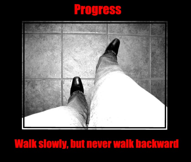
I really liked this shot during the challenge, gave it an 8 as a matter of fact, now let me try to explain why it didn't get a 10, though it has that potential for me.
First the aspect ratio of the size of the thighs to the shoes is really distracting, the feet look so tiny compared to the thighs in the shot, it's a bit disorienting and hard to look at for any length of time. For a poster to work for me I want to be able to look at all day long if needed or at least want to look at without causing a bit of eye strain. The washed out look on the thighs is also a bit distracting yet works for this shot overall. It grabs your attention and brings you into the shot. If we could get those feet to look just a bit bigger! :)
Also the cropping or angle on the floor is also off a bit and makes me a bit dizzy to look at it for too long. Maybe a slight rotation to balance it a bit would also help with the foot/thigh equation.
I like the lettering and the font but the side borders seem very heavy on this shot. Maybe if you brought them in a bit, left the top font as is and made the lower font a bit smaller (not the same size as the top) so it would fit it would work just a bit better.
Hope all this helps, if you decide to play with this image and take any of my suggestions, I would love to see it!
Good Luck In Future Challenges!
Deannda
DNeufer@stny.rr.com if you have any questions or want to discuss this further!
The wide-angle focal length effectively exaggerates the length of the legs. It also distorts the floor tile, but that's minor. The whiteness of the upper legs is distracting. I don't care for the red letters; it is too intense. I think orange or gold would go better with the message.
Highly quirky but works very well for me. It has a really modernist feel to it - the limited colour palette of just black, white and red is so classic. The image itself is gritty, offers a weird perspective and makes you look and look again.
Interesting viewpoint. Like that it is b&w. The mat is well done, but the red text took it over board. If your text was simply white and a bit less heavy, I would have scored it much higher.
Perspective distortion (?) on the right bothers me some. I might have tried cropping a square out of this, and put it on a vertical layout with two lines of type below, maybe shortening it to
Walk Slowly,
But Never Backwards






 Add photograph to your favorites
 Add photographer to your favorites


 Photographer found comment helpful.


