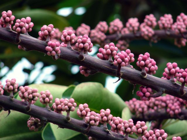
Nice study of shapes and textures, but the composition isn't strong enough. What is the point of focus? The trick is to lead the viewer's eye and give it flow. Here, the eye is led out of the shot in several places... it's not clear what is really important and why we should spend a while looking at it. What does it communicate?
I like the complementary colors of magenta and green, I like the strong diagonals, but overall the compostion is cluttered, the bright contrasting areas in the background are distracting






 Add photograph to your favorites
 Add photographer to your favorites


 Photographer found comment helpful.


