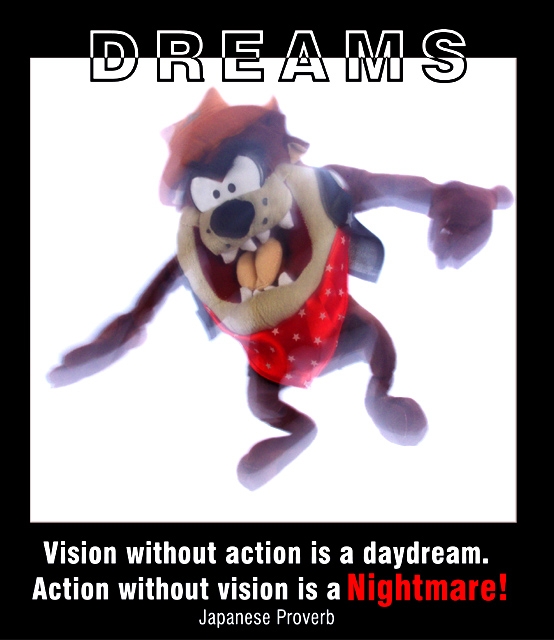
This was taken outside at dusk in order to get a good background, and a good lighting effect. I held Taz from three points; around the shoulders and from each leg. I "dragged the shutter" for 3 seconds after initial flash. The 3-d effect from the tongue comes from the fact that he twisted about his body so there was very little movement at the center.
I cloned-out some of the background out that was uneven, and removed the flash from his right eye. I wouldn't have been disapointed though if I couldn't have edited it all. I then altered the contrast and brightness a touch, and the color curves as well.
Statistics
Place: 75 out of 94 Avg (all users): 4.7556 Avg (commenters): 4.6250 Avg (participants): 4.4706 Avg (non-participants): 4.9286 Views since voting: 1349 Votes: 180 Comments: 9 Favorites: 0
Greetings from the Critique club Ok, this is difficult to critique, There are two elements so I'll first comment on the image.
I'm afraid the image is not very good. After reading your description I can see what you were trying to do, I think. Giving the impression of movement to an object is difficult at best.
I'm assuming the brightness was an attempt to give it a dream like state. Possibly if you had done just that and not also tried to add movement it would have worked better.
It's better to not try and have multiple effects. There are some brighter than other areas spots, esp. on the face, that shouldn't be there.
Also using a stuffed animal rarely gets high marks. I also don't see how this one relates to the proverb.
RE: the text. There is too much of it for one thing. The Dreams is well done. Reversing the colours of the outline is a good technique.
The font at the bottom should be lighter. It's overpowering at this point. While it appears to be a similar family the fact that it is heavy causes it to appear to contrast. Japanese Proverb should be much smaller. And the proverb itself should probably be in quotes.
Very nice work.
I like the font on Dreams.
I do not like the font at the bottom.
Japanese Proverb should have been smaller and in ( ) I think.
The image seems to be somewhat washed out a little with all the lighting.
Still very nice work and efort.
The photo does seem nightmarish, although unnecessarily washed out. It would be a bit zany by itself, but works in the context of the poster. Splitting the word "DREAMS" was a good idea, but white lines on a black background look thicker than the opposite, so top and bottom don't really match.
You are mixing too many different text styles for this to bee effective. The text on the top of the image is too much. It's heavy and half reversed. I am not sure about this motivationg me into anything else but running away from it.





 Add photograph to your favorites
 Add photographer to your favorites


 Photographer found comment helpful.


