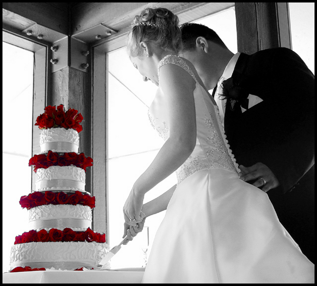
A good friend of mine just got married on the 27th and this is one of my favorite pictures. This is the first cut into the cake and I had to have a picture of this event.
Here are the (simplified) steps I made to get this image:
1. Crop image.
2. Resize.
3. Select roses and inverse.
4. Set hue and saturation to zero.
5. Adjusted color balance to bring out more red in the roses.
6. Adjusted hue and saturation again.
7. Selected small areas some of the rose layers to eliminate a bit of excess blue via color balance.
8. Unsharp mask.
9. Added border.
10. Save and add compression to fit file size requirement.
Yes, I know that the image looks obviously altered with the red roses but it didn't look right when they were a dark gray. I deviated from the recommendations to make a photo look natural because I wanted the roses to stand out. I'll probably lose a lot of points on that alone.
Statistics
Place: 28 out of 193 Avg (all users): 6.4605 Avg (commenters): 7.4000 Avg (participants): 6.4254 Avg (non-participants): 6.5185 Views since voting: 2389 Votes: 215 Comments: 32 Favorites: 4 (view)
Nice to know that people still view and leave comments! You're absolutely right and for the life of me I cannot recall if I did feather the roses but like you said I probably didn't and should have. They do have an artificial look about them, don't they? I appreciate your comments.
That is a great picture, I like the lighting, with the shadows that were created. One thing maybe you could have a little bit of feathering on your selection of the roses so that they don't completely look like they are cut out. They have a very straight edge and the picture is soft feeling.
Many thanks to all who submitted comments about this entry. I really appreciate the constructive comments that everyone posted. I learned a lot about this camera and what I can do with Photoshop to get the effect I want. However, not all imperfections were fixable (due to lack of skills) or were fixed (issues mentioned in the comments). It does take a second or even fourth or fifth eye to see everything that should be fixed to make an entry worthy of a ribbon. Now that the ruleset has changed dramatically, I think I can "kick it up a notch" so to speak for upcoming challenges and hopefully push myself further in both photography and Photoshop skills.
When I took this picture, I didn't have a challenge in mind. I was just taking pictures for the sake of taking pictures. When I was browsing the files of the new couple, I thought about submitting this one. First I made the entire image black and white. I was happy with that until I added some uniform and monochrome noise. Then I thought about isolating the roses and leaving those red (except for the chromatic abberations which are a pain to fix). Slowly I came up with the results you see above. I wish I had left the noise in, however, like laheff suggested. Although I don't know if I would have used as much as she suggested, some noise might have been better than none.
Again, thanks for all the great suggestions and comments! :)
Nice PhotoShop work. If I were you I would have added in some clouds in the background frame area as it looks a bit washed out or possibly 1.6 of noise. But excellent none the less.
I think your creativity saved this photo, because the background must be a photographers nightmare. The person who decided to put the cake in that place deserves one in the face. :)
Ignoring the background;
I really like your composition. The blade just touches the cake, the positioning of the newlyweds, the hand (with the ring) of the man on her, err rear.....
The exposure and B&W toning is just excellent.
Leaving the colors (I am sure that I see red and green, so it must be more than just partial desaturation) of the roses makes the cake stand out so well. And that is just what was needed with this background. The cake and the couple draw most of the attention. Good thinking!
If it were not for the background I would give this a 9, without that excellent toning & exposure and the colors in the cake I would give it a 5. That averages to a 7, but I'll give a bonus point for saving the shot: 8. :)
Great contrast here. I love how white you got the whites of the dress and cake and how vivid the red of the flowers. How did you get the whites so white and the black so black?!!! I like the angle of view so that you've hidden their faces and made this a picture that many couples and would be brides identify with. So well done!
Nice treatment on the cake and roses. I would have liked to see the expressions on the faces of the b & g. Wonderful detail on the bodice of the gown - crystal and buttons - but also on the L-brackets on upper left, which distracts my eye.
a nice image capturing a special moment. good use of selective desaturation. I wouldn't have shot against the bright windows though as the highlights are totally blown out here.
Gorgeous shot! This is outstanding I like the balck and white and leaving the color on the cake, good choice, this makes the detail of the cake stand out as well as the couple good job.10
Nice shot but too bad about the lines in the corner windows. I also find that the glass by the bride's hand takes away from this very interesting shot. Too bad we can't see the grooms profile either. One of the nicest desats I have seen on this site.
Anyone would be delighted to have such a beautiful portrait of such a memorable day. The red roses really make this picture pop. I just wish we could see the expression on the grooms face as well. You get my 9! Good luck!
Awesome color in the roses. One thing that you might think about doing is blur the background just a bit. Seems the wood and bolts are fighting to take away from the main subject. good luck 8
Beautiful wedding shot! Absolutely gorgeous! I love the desat just leaving the bright red roses! What a beautiful cake, and a beautiful catch! Nice job with the blowout of the black windows...definitely gives a feel to the shot, and the details are superb. Just beautifullly done! The only thing I would comment on, but I'm not sure it would be possible is to see the grooms face. Still a 10 in my book! great job, good luck!






 Add photograph to your favorites
 Add photographer to your favorites

 Photographer found comment helpful.


