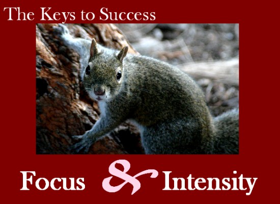
I like the picture and the font and wording are good too. I'm not sure about the choice for the border though. Perhaps a dark gray, black or even white would have been nice. Good luck with the challenge!
Nice pose mr. squirrel!
I like the color of the background but the 'pink' is unattractive to me. The shot of the little squirrel is very fitting for this challenge.
Photo is very nice, but kind of small for the large red mat. The text totally overpowers the image which should be the main focus. My eyes immediately go the the large &. If you are centering the text, centre both lines, or make them both flush to the left. Mixing it up together creates chaotic message. Your poster is intense as you may have intended, but cleaning it up a bit would have made it into a very well done poster.





 Add photograph to your favorites
 Add photographer to your favorites


