|
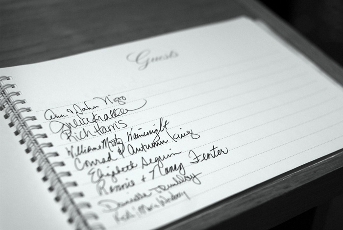
I like this one, it's well composed. The only thing I can nit pick about is the DOF. It's kinda strangly placed on this one. The thing I would do is flip the book around so "guests" is closest to you and focus on that. Stop down the lens a bit to increase the DOF and have the names slowly fade out in the background. Maybe a little selective desat with a few props added on and it would be great. Just my thoughts, sorry for rambling. |




 Add photograph to your favorites
 Add photographer to your favorites

 Photographer found comment helpful.