I think this would have been stronger if you used a vertical crop in lieu of the horizontal. On my monitor the background is just a tad to dark. The font seems to have an oriental feel?. Nice work still a very nice vote.
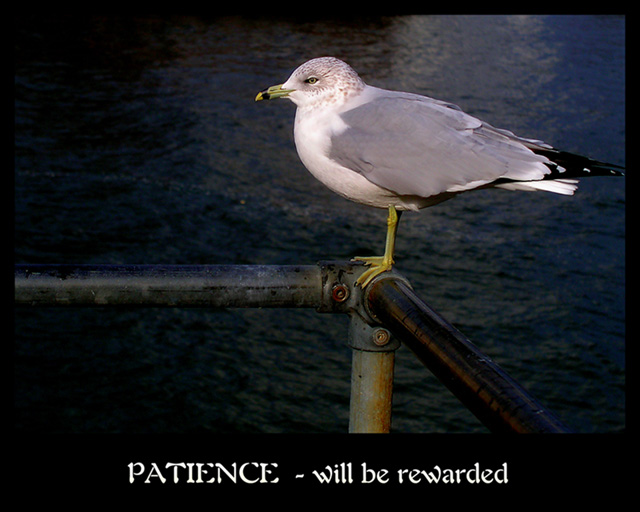
This one made me smile. You've captured the perfect moment and expression on the bird's face. Only suggestion - different/plainer font - I thought it detracted from the overall statement.
Good bird shot. The bright subject stands out nicely against the dark background. Good focus and DOF. Needs a little more space at the top. The poster layout is OK, but the font choice is poor; the breaks in the letters are too wide for white-on-black use. The connection between the photo and the text is tenuous; birds aren't generally known for their extreme patience.
Patience for what? There's no definitive indication that the seagull is actually waiting for anything at all, so for me this concept isn't strong enough. Nice image though.
I think you should have made the vertical lines even, rather than the horizontal, as this seems too far tilted to the right to me. Also, a white keyline seperating the photo from the border would have helped the shot. 6
Photo is superb. Colours look very natural. But the font is kind of wild and unseen in pro posters. But if that's your style, then go for it. Well done photo.
So true ... YOUR patience was rewarded with this beautiful photograph :-). Beautiful composition, great colors, and excellent lighting (focused on the bird) ...






 Add photograph to your favorites
 Add photographer to your favorites

 Photographer found comment helpful.


