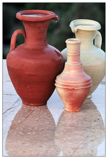
Nice background colors for these vases/pots. I don't really like that the right one is slightly cut off, and the background is pretty noisy. The tile large amount of tile on the bottom is just too empty; a different crop might help.
i would suggest a change in compostion/crop here. the white pot is cropped off so that throws the balance off. and the reflection in the tiles is a bit distracting
nice idea, but the vases(amphores do not look like persons. crop at right and bottom (full reflection woulda been nice) is too tight IMO. Background is a bit noisy
I don't exactly get the title, but I'm not a dweeb who docks down for titles. Your picture clearly has the element water, so you meet the challenge. I like the placement of the pitchers, and I surprisingly like the image grain. It works well with the pitcher texture. Good border. I only wish the right vase wasn't cropped out. 6





 Add photograph to your favorites
 Add photographer to your favorites


 Photographer found comment helpful.


